If are looking to hire an analytics professional, please send me a message at [email protected]. I am looking for new opportunities and available to start ASAP.
sPowerlifting in the United States has seen explosive growth in recent years, both in popularity and participation. National federations like USA Powerlifting have reported a sharp increase in membership, with thousands of new lifters signing up each year. Notably, there has been a surge in female powerlifters, teen athletes, and first-time competitors entering the sport.
Local powerlifting meets across the country are frequently sold out, and national events now draw large in-person crowds and online audiences through live streaming. This rapid expansion has been fueled in part by the rise of fitness content on social media platforms like Instagram, TikTok, and YouTube, where lifters share workouts, meet results, and training progress with engaged communities.
Another contributing factor is the growth of powerlifting-friendly gyms and strength training facilities, which have created more inclusive spaces for beginners and elite lifters alike. These gyms offer specialized equipment and coaching that support long-term athlete development.
This cultural shift reflects more than just a trend—it signals a broader move toward strength-based fitness, discipline, and goal-oriented training. As powerlifting continues to gain mainstream recognition, its influence is reshaping how Americans approach physical fitness.
In this article, I analyze the historical growth of powerlifting in the U.S. using data from sanctioned competitions.
Topics include:
The rise in the number of powerlifting meets by year and region
Demographic shifts in athlete participation (age, gender, etc.)
Trends in performance standards over time
Whether you’re a competitive lifter, coach, gym owner, or simply curious about the sport, this analysis provides a comprehensive look at how powerlifting in America has evolved into one of the fastest-growing strength sports today.
Number of Powerlifting Meets by Year
There has been a significant increase in the number of powerlifting meets in America over the past decade. From 2010 to 2024, there was a 700% increase in the number of powerlifting meets. Since 2010, the only year where there was a decline was in 2020 during the Covid pandemic.
TopCountries = mydat["MeetCountry"].value_counts().head(1).reset_index()
TopCountries.columns = ['MeetCountry', 'Count']

NumMeets = (
    mydat[
         (pl_dat['MeetCountry'].isin(TopCountries["MeetCountry"]))
     ]
    .groupby(['MeetCountry','Meet_date_Year'])['MeetID']
    .nunique()
    .reset_index()
    .rename(columns={'MeetID': 'Unique_Meets'})
)

# Calculate percentage change within each country
NumMeets['Pct_Increase'] = (
    NumMeets
    .groupby('MeetCountry')['Unique_Meets']
    .pct_change()
    .multiply(100)
    .round(3)
)

NumMeets

# Create the plot
plot = (
    ggplot(NumMeets, aes(x='Meet_date_Year', y='Unique_Meets')) +
    geom_line(size=1.3, color="red") +
    geom_point(size=1.6) +
    labs(
        title="Powerlifting Meets in the USA per Year (non IPF)",
        x="",
        y="Number of Meets",
        caption='www.mathewanalytics.com'
    )  +
    scale_y_continuous(limits=(0, 3000)) +  # Increase upper y-axis limit
    theme(
        axis_title_x=element_text(weight='bold'),
        axis_title_y=element_text(weight='bold'),
        plot_title=element_text(weight='bold')
    ) +
    theme(
        plot_title=element_text(size=12, weight='bold', color='black'),
        axis_title_x=element_text(size=12, weight='bold', color='black'),
        axis_title_y=element_text(size=10, weight='bold', color='black'),
        axis_text_x=element_text(size=10, weight='bold', color='black'),
        axis_text_y=element_text(size=10, weight='bold', color='black'),
        strip_text_x=element_text(size=10, weight='bold', color='black'),
        strip_text_y=element_text(size=10, weight='bold', color='black'),
        axis_line=element_line(color='black', size=0.3),
        panel_border=element_rect(color='black', fill=None, size=0.3),
        plot_caption=element_text(size=12, weight='bold')
    )
)

print(plot)

Average Number of Lifters per Meet
While the average number of lifters per meet saw substantial increases in the 2010s, meets seem to be getting slightly smaller after covid.
# Prepare the data
plot_data = (
    mydat
    .groupby(['Meet_date_Month_YMD', 'MeetID'])
    .size()
    .reset_index(name='Num_Lifters')
)

avg_lifters_per_meet_by_month = (
    plot_data
    .groupby('Meet_date_Month_YMD')['Num_Lifters']
    .mean()
    .reset_index(name='Avg_Lifters_Per_Meet')
)

avg_lifters_per_meet_by_month

# Create the plot
(
    ggplot(avg_lifters_per_meet_by_month, aes(x='Meet_date_Month_YMD', y='Avg_Lifters_Per_Meet')) +
    geom_line(size=1.2, color="red") +
    geom_point(size=1.5) +
    labs(
        title="Average Number of Powerlifters per Meet in the USA per Month (non IPF)",
        x="",
        y="Average Number of Powerlifters per Meet",
        caption='www.mathewanalytics.com'
    )  +
    theme(
        axis_title_x=element_text(weight='bold'),
        axis_title_y=element_text(weight='bold'),
        plot_title=element_text(weight='bold')
    ) +
    scale_y_continuous(limits=(0, 100)) +  # Increase upper y-axis limit
    theme(
        axis_title_x=element_text(weight='bold'),
        axis_title_y=element_text(weight='bold'),
        plot_title=element_text(weight='bold')
    ) +
    theme(
        plot_title=element_text(size=12, weight='bold', color='black'),
        axis_title_x=element_text(size=12, weight='bold', color='black'),
        axis_title_y=element_text(size=10, weight='bold', color='black'),
        axis_text_x=element_text(size=10, weight='bold', color='black'),
        axis_text_y=element_text(size=10, weight='bold', color='black'),
        strip_text_x=element_text(size=10, weight='bold', color='black'),
        strip_text_y=element_text(size=10, weight='bold', color='black'),
        axis_line=element_line(color='black', size=0.3),
        panel_border=element_rect(color='black', fill=None, size=0.3),
        plot_caption=element_text(size=12, weight='bold')
    )
)

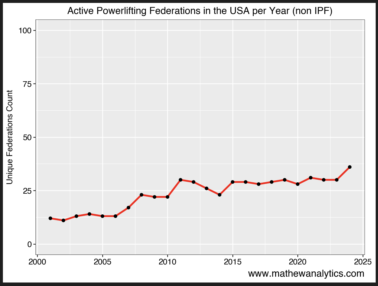
Number of Active Federations
Over the past two decades, there has not been a substantial increase in the number of active federations. This runs counter to the common narrative that there has been a substantial increase in the amount of powerlifting federations.
mydat['Date_year'] = pd.to_datetime(mydat['Meet_date_YMD']).dt.year

# Prepare the data
plot_data = (
    mydat.groupby('Date_year')['Federation']
    .nunique()
    .reset_index()
    .rename(columns={'Federation': 'Unique_Federations'})
)

# Create the plot
(
    ggplot(plot_data, aes(x='Date_year', y='Unique_Federations')) +
    geom_line(size=1.2, color="red") +
    geom_point(size=1.5) +
    labs(
        title="Active Powerlifting Federations in the USA per Year (non IPF)",
        x="",
        y="Unique Federations Count",
        caption='www.mathewanalytics.com'
    )  +
    theme(
        axis_title_x=element_text(weight='bold'),
        axis_title_y=element_text(weight='bold'),
        plot_title=element_text(weight='bold')
    ) +
    scale_y_continuous(limits=(0, 100)) +  # Increase upper y-axis limit
    theme(
        plot_title=element_text(size=12, weight='bold', color='black'),
        axis_title_x=element_text(size=12, weight='bold', color='black'),
        axis_title_y=element_text(size=10, weight='bold', color='black'),
        axis_text_x=element_text(size=10, weight='bold', color='black'),
        axis_text_y=element_text(size=10, weight='bold', color='black'),
        strip_text_x=element_text(size=10, weight='bold', color='black'),
        strip_text_y=element_text(size=10, weight='bold', color='black'),
        axis_line=element_line(color='black', size=0.3),
        panel_border=element_rect(color='black', fill=None, size=0.3),
        plot_caption=element_text(size=12, weight='bold')
    )

)
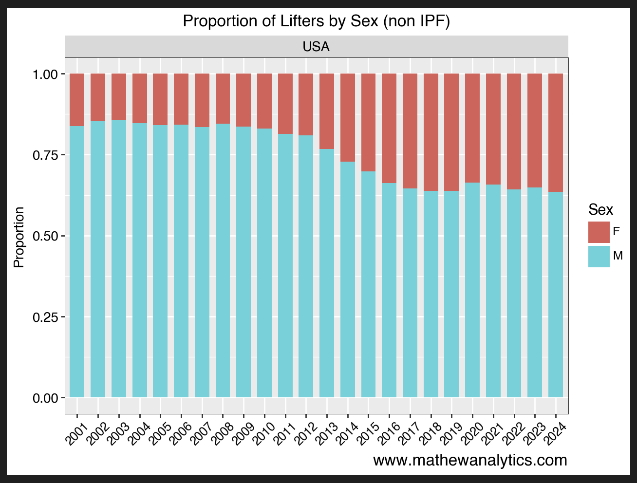
Proportion of Lifters by Sex
It’s no surprise that powerlifting has historically been a male dominant sport. However, over the past decade, the percentage of women who compete has doubled.
# Add ID column
mydat['ID'] = range(1, len(mydat) + 1)

# View first 2 rows
# print(mydat.head(2))

# Extract year from date
mydat['Date_year'] = pd.to_datetime(mydat['Meet_date_YMD']).dt.year

# Filter for USA meets
usa_meets = mydat[mydat['MeetCountry'] == 'USA']

# Group and count
agg_data = (
    usa_meets[usa_meets['Equipment'] != 'Unlimited']  # Filter out 'Unlimited'
    .groupby(['MeetCountry', 'Sex', 'Date_year'])
    .size()
    .reset_index(name='N')
)

# Compute proportion by MeetCountry and Date_year
agg_data['prop'] = agg_data.groupby(['MeetCountry', 'Date_year'])['N'].transform(lambda x: x / x.sum())

agg_data


plot = (
    ggplot(agg_data, aes(x='factor(Date_year)', y='prop', fill='Sex')) +
    geom_bar(stat='identity', position='fill', width=0.7) +
    labs(
        title='Proportion of Lifters by Sex (non IPF)',
        x='',
        y='Proportion',
        caption='www.mathewanalytics.com'
    ) +
    facet_wrap('~MeetCountry') +
    theme(
        plot_title=element_text(size=12, weight='bold', color='black'),
        axis_title_x=element_text(size=10, weight='bold', color='black'),
        axis_title_y=element_text(size=10, weight='bold', color='black'),
        axis_text_x=element_text(size=9, weight='bold', color='black', angle=45),
        axis_text_y=element_text(size=10, weight='bold', color='black'),
        strip_text_x=element_text(size=10, weight='bold', color='black'),
        strip_text_y=element_text(size=10, weight='bold', color='black'),
        axis_line=element_line(color='black', size=0.3),
        panel_border=element_rect(color='black', fill=None, size=0.3),
        plot_caption=element_text(size=12, weight='bold')
    )

)

print(plot)
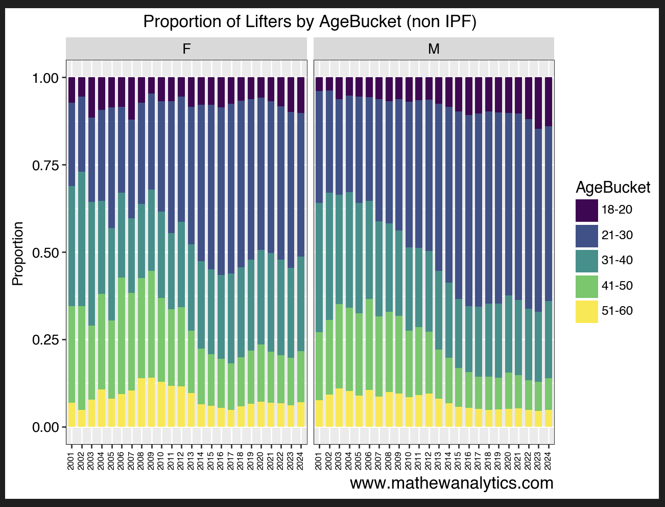
Proportion of Lifters by Age and Sex
It’s no surprise that powerlifting is a young persons game. With that said, there seems to be a unique trend over the past few years whereby those over the age of 31 account for a larger proportion of female lifters.
# Add ID column
mydat['ID'] = range(1, len(mydat) + 1)

# View first 2 rows
# print(mydat.head(2))

# Extract year from date
mydat['Date_year'] = pd.to_datetime(mydat['Meet_date_YMD']).dt.year

# Filter for USA meets
usa_meets = mydat[mydat['MeetCountry'] == 'USA']

# Group and count
agg_data = (
    usa_meets[usa_meets['Equipment'] != 'Unlimited']  # Filter out 'Unlimited'
    .groupby(['MeetCountry', 'AgeBucket', 'Sex', 'Date_year'])
    .size()
    .reset_index(name='N')
)

# Compute proportion by MeetCountry and Date_year
agg_data['prop'] = agg_data.groupby(['MeetCountry', 'Date_year'])['N'].transform(lambda x: x / x.sum())


plot = (
    ggplot(agg_data, aes(x='factor(Date_year)', y='prop', fill='AgeBucket')) +
    geom_bar(stat='identity', position='fill', width=0.7) +
    labs(
        title='Proportion of Lifters by AgeBucket (non IPF)',
        x='',
        y='Proportion',
        caption='www.mathewanalytics.com'
    ) +
    facet_wrap('~Sex') +
    theme(
        plot_title=element_text(size=12, weight='bold', color='black'),
        axis_title_x=element_text(size=10, weight='bold', color='black'),
        axis_title_y=element_text(size=10, weight='bold', color='black'),
        axis_text_x=element_text(size=6, weight='bold', color='black', angle=90),
        axis_text_y=element_text(size=10, weight='bold', color='black'),
        strip_text_x=element_text(size=10, weight='bold', color='black'),
        strip_text_y=element_text(size=10, weight='bold', color='black'),
        axis_line=element_line(color='black', size=0.3),
        panel_border=element_rect(color='black', fill=None, size=0.3),
        plot_caption=element_text(size=12, weight='bold')
    )

)

print(plot)
Proportion of Lifters by Equipment
A trend almost every powerlifter is aware of is the death of equipped powerlifting and the rise of raw powerlifting.
# Add ID column
mydat['ID'] = range(1, len(mydat) + 1)

# View first 2 rows
# print(mydat.head(2))

# Extract year from date
mydat['Date_year'] = pd.to_datetime(mydat['Meet_date_YMD']).dt.year

# Filter for USA meets
usa_meets = mydat[mydat['MeetCountry'] == 'USA']

# Group and count
agg_data = (
    usa_meets[usa_meets['Equipment'] != 'Unlimited']  # Filter out 'Unlimited'
    .groupby(['MeetCountry', 'Equipment', 'Date_year'])
    .size()
    .reset_index(name='N')
)

# Compute proportion by MeetCountry and Date_year
agg_data['prop'] = agg_data.groupby(['MeetCountry', 'Date_year'])['N'].transform(lambda x: x / x.sum())

agg_data

plot = (
    ggplot(agg_data, aes(x='factor(Date_year)', y='prop', fill='Equipment')) +
    geom_bar(stat='identity', position='fill', width=0.7) +
    labs(
        title='Proportion of Lifters by Equipment (non IPF)',
        x='',
        y='Proportion',
        caption='www.mathewanalytics.com'
    ) +
    #facet_wrap('~Sex') +
    theme(
        plot_title=element_text(size=12, weight='bold', color='black'),
        axis_title_x=element_text(size=12, weight='bold', color='black'),
        axis_title_y=element_text(size=10, weight='bold', color='black'),
        axis_text_x=element_text(size=6, weight='bold', color='black', angle=90),
        axis_text_y=element_text(size=10, weight='bold', color='black'),
        strip_text_x=element_text(size=10, weight='bold', color='black'),
        strip_text_y=element_text(size=10, weight='bold', color='black'),
        axis_line=element_line(color='black', size=0.3),
        panel_border=element_rect(color='black', fill=None, size=0.3),
        plot_caption=element_text(size=12, weight='bold')
    )

)

print(plot)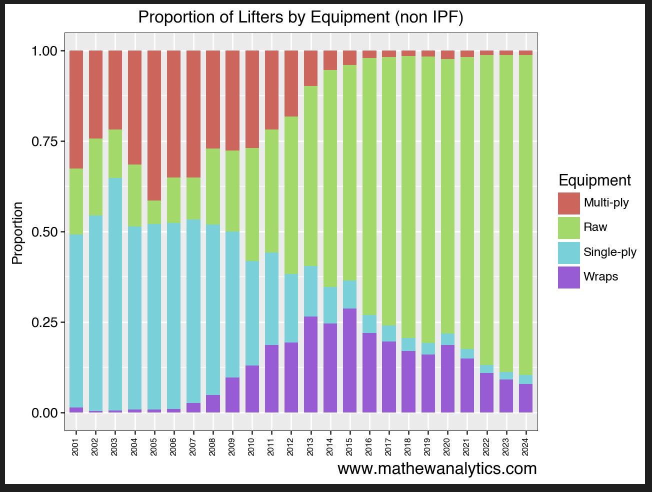
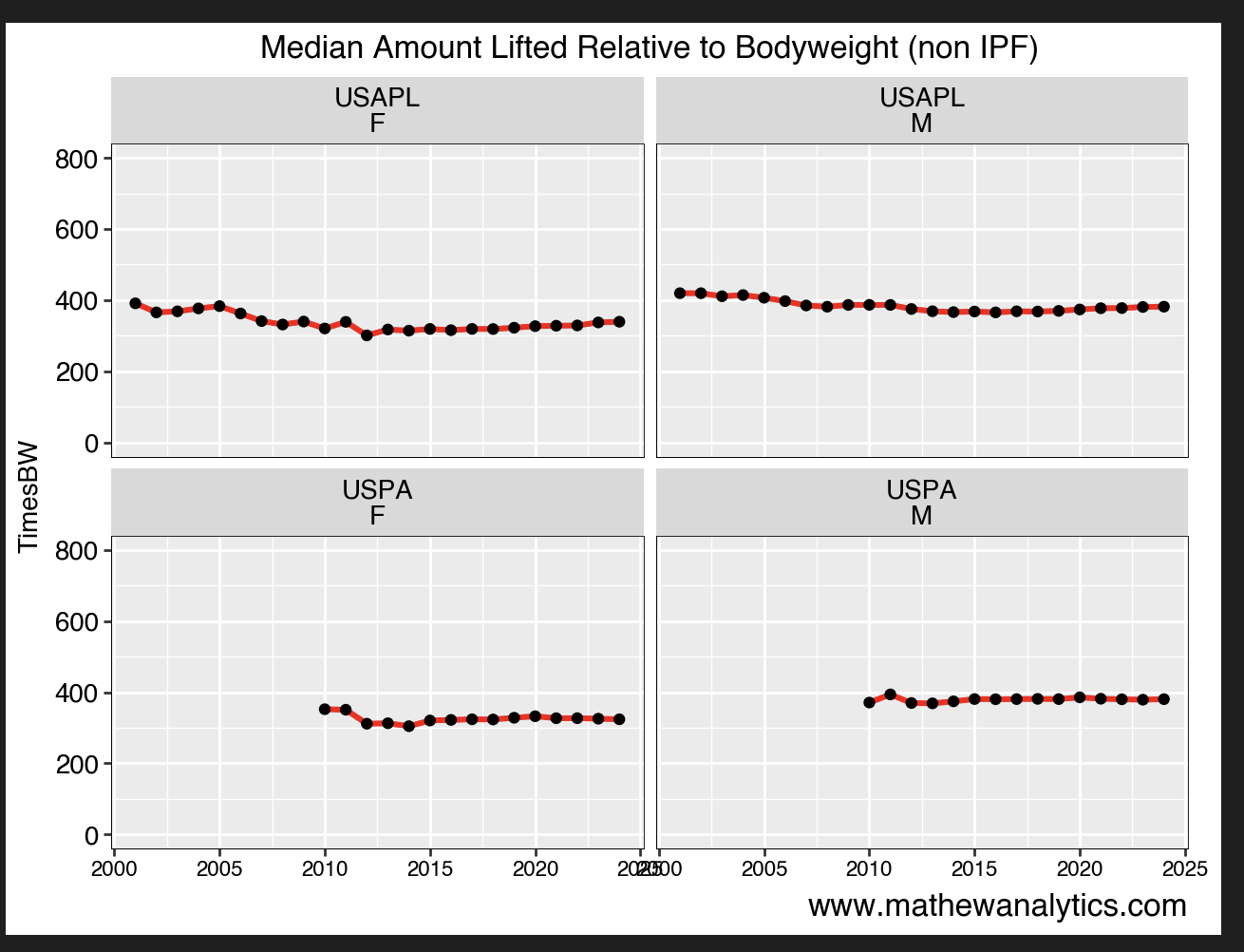
Top Federations and Their Median Dots
Lifters in the USPA tend to have higher dots than those in the USAPL. This is not surprising as those in the USAPL tend to be younger and are generally not on performance enhancing drugs.
TopFederation = mydat["Federation"].value_counts().head(2).reset_index()
TopFederation.columns = ['Federation', 'Count']
TopFederation

NumMeets = (
    mydat[
         (pl_dat['Federation'].isin(TopFederation["Federation"]))
     ]
    .groupby(['MeetCountry','Federation','Sex','Date_year'])['Dots']
    .median()
    .reset_index(name='Avg_Dots')
)

NumMeets


plot = (
    ggplot(NumMeets, aes(x='Date_year', y='Avg_Dots')) +
    geom_line(size=1.2, color="red") +
    geom_point(size=1.5) +
    #geom_violin() +
    labs(
        title='Median Amount Lifted Relative to Bodyweight (non IPF)',
        x='',
        y='TimesBW',
        caption='www.mathewanalytics.com'
    ) +
    scale_y_continuous(limits=(0, 800)) +  # Increase upper y-axis limit+
    facet_wrap('~Federation+Sex') +
    #coord_flip() +
    #scale_x_discrete(limits=combined_df['MeetCountry'].unique()) +  # Adjust x-axis limits
    #scale_y_continuous(limits=(0, 4)) +  # Set y-axis limit from 0 to 4
    theme(
        plot_title=element_text(size=12, weight='bold', color='black'),
        axis_title_x=element_text(size=12, weight='bold', color='black'),
        axis_title_y=element_text(size=10, weight='bold', color='black'),
        axis_text_x=element_text(size=8, weight='bold', color='black'),
        axis_text_y=element_text(size=10, weight='bold', color='black'),
        strip_text_x=element_text(size=10, weight='bold', color='black'),
        strip_text_y=element_text(size=10, weight='bold', color='black'),
        axis_line=element_line(color='black', size=0.3),
        panel_border=element_rect(color='black', fill=None, size=0.3),
        plot_caption=element_text(size=12, weight='bold')
    )
)

print(plot)
Strength Standards
On average, women tend to bench 1 times their bodyweight while men bench 1.5 times their bodyweight. The biggest difference between men and women is in regards to the squat.
AvgSquat = (
mydat[
        (pl_dat['MeetCountry'].isin(TopCountries["MeetCountry"]))
    ]
.groupby(['MeetCountry','Sex'])['SquatTimesBW']
.mean().reset_index()
.rename(columns={'SquatTimesBW': 'TimesBW'})
.sort_values(by='TimesBW', ascending=False)
.assign(Lift='Squat')
)

AvgBench = (
mydat[
        (pl_dat['MeetCountry'].isin(TopCountries["MeetCountry"]))
    ]
.groupby(['MeetCountry','Sex'])['BenchTimesBW']
.mean().reset_index()
.rename(columns={'BenchTimesBW': 'TimesBW'})
.sort_values(by='TimesBW', ascending=False)
.assign(Lift='Bench')
)

AvgDeadlift = (
mydat[
        (pl_dat['MeetCountry'].isin(TopCountries["MeetCountry"]))
    ]
.groupby(['MeetCountry','Sex'])['DeadliftTimesBW']
.median().reset_index()
.rename(columns={'DeadliftTimesBW': 'TimesBW'})
.sort_values(by='TimesBW', ascending=False)
.assign(Lift='Deadlift')
)

combined_df = pd.concat([AvgSquat, AvgBench, AvgDeadlift], axis=0, ignore_index=True)

combined_df

combined_df = combined_df.sort_values('TimesBW', ascending=False)

combined_df


# Sort combined_df by TimesBW in descending order
combined_df = combined_df.sort_values('TimesBW', ascending=False)

# Make MeetCountry a categorical variable with levels in the desired order (highest to lowest TimesBW)
combined_df['MeetCountry'] = pd.Categorical(
    combined_df['MeetCountry'],
    categories=combined_df.groupby('MeetCountry')['TimesBW'].median().sort_values(ascending=False).index,
    ordered=True
)

# Now create the plot
plot = (
    ggplot(combined_df, aes(x='Sex', y='TimesBW', fill='Sex')) +
    geom_bar(stat='identity', width=0.7) +
    labs(
        title='Median Amount Lifted Relative to Bodyweight (non IPF meets)',
        x='',
        y='TimesBW',
        caption='www.mathewanalytics.com'
    ) +
    facet_wrap('~MeetCountry+Lift') +
    #coord_flip() +
    #scale_x_discrete(limits=combined_df['MeetCountry'].unique()) +  # Adjust x-axis limits
    scale_y_continuous(limits=(0, 4)) +  # Set y-axis limit from 0 to 4
    theme(
        plot_title=element_text(size=12, weight='bold', color='black'),
        axis_title_x=element_text(size=12, weight='bold', color='black'),
        axis_title_y=element_text(size=10, weight='bold', color='black'),
        axis_text_x=element_text(size=10, weight='bold', color='black'),
        axis_text_y=element_text(size=10, weight='bold', color='black'),
        strip_text_x=element_text(size=10, weight='bold', color='black'),
        strip_text_y=element_text(size=10, weight='bold', color='black'),
        axis_line=element_line(color='black', size=0.3),
        panel_border=element_rect(color='black', fill=None, size=0.3),
        plot_caption=element_text(size=12, weight='bold')
    )
)

print(plot)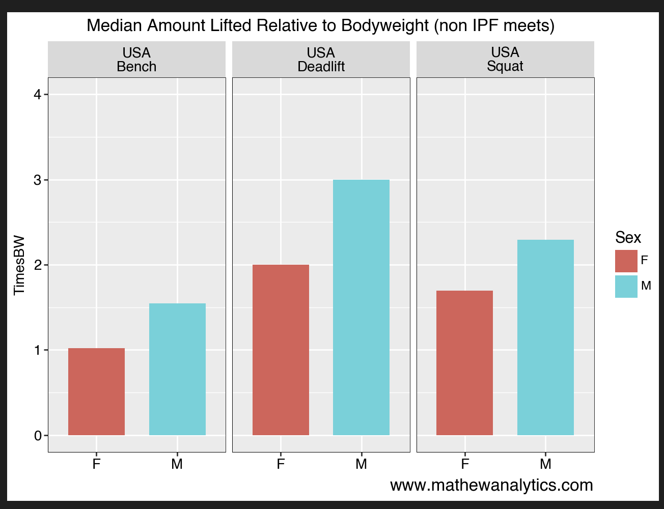
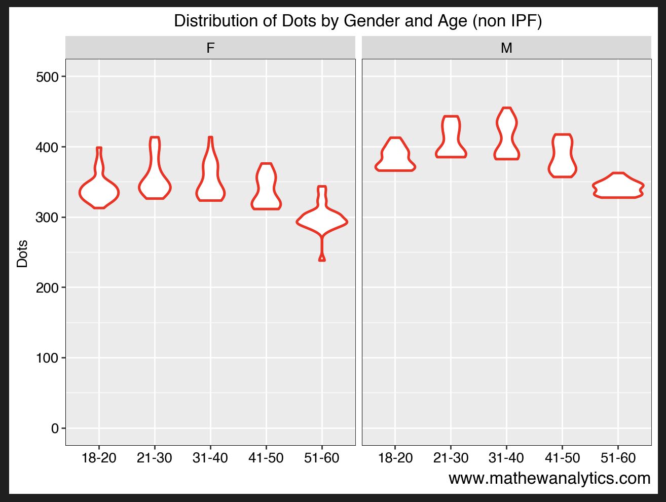
Median Dots by AgeBucket
For both men and women, they tend to have the highest Dots values in their 20s and 30s.
result = (
    mydat[
            (pl_dat['MeetCountry'].isin(TopCountries["MeetCountry"]))
        ]
    .groupby(["MeetCountry", "Date_year", "AgeBucket", "Sex"])
    .agg({'Dots': ['count', 'mean']})
)


result.columns = ['Dots_count', 'Dots_mean']

result = result.sort_values('Dots_mean', ascending=False).reset_index()

summary = (
    mydat.groupby(["Date_year", "AgeBucket", "Sex"])["Dots"]
    .agg(["mean", "std"])
    .reset_index()
    .rename(columns={"mean": "Mean", "std": "SD"})
)
summary["ymin"] = summary["Mean"] - summary["SD"]
summary["ymax"] = summary["Mean"] + summary["SD"]

summary

plot = (
    ggplot() +
    geom_violin(summary, aes(x="AgeBucket", y="Mean"), size=1, color="red") +
    labs(
        title="Distribution of Dots by Gender and Age (non IPF)",
        x="",
        y="Dots",
        caption='www.mathewanalytics.com'
        ) +
    labs(caption = "www.mathewanalytics.com") +
    facet_wrap('~Sex') +
    scale_y_continuous(limits=(0, 500)) +
    theme(
        plot_title=element_text(size=12, weight='bold', color='black'),
        axis_title_x=element_text(size=12, weight='bold', color='black'),
        axis_title_y=element_text(size=10, weight='bold', color='black'),
        axis_text_x=element_text(size=10, weight='bold', color='black'),
        axis_text_y=element_text(size=10, weight='bold', color='black'),
        strip_text_x=element_text(size=10, weight='bold', color='black'),
        strip_text_y=element_text(size=10, weight='bold', color='black'),
        axis_line=element_line(color='black', size=0.3),
        panel_border=element_rect(color='black', fill=None, size=0.3),
        plot_caption=element_text(size=12, weight='bold')
    )
)

print(plot)
In future posts, I will compare these trends occuring in the US against other countries. While powerlifting has witnessed significant growth in the US, it remains a relatively niche sport.
