A. Introduction
The growth of Crossfit has been one of the biggest developments in the fitness industry over the past decade. Promoted as both a physical exercise philosophy and also as a competitive fitness sport, Crossfit is a high-intensity fitness program incorporating elements from several sports and exercise protocols such as high-intensity interval training, Olympic weightlifting, plyometrics, powerlifting, gymnastics, strongman, and so forth. Now with over 10,000 Crossfit affiliated gyms (boxes) throughout the United States, the market has certainly become more saturated and gyms must initiate more unique marketing strategies to attract new members. In this post, I will investigate how some prominent Crossfit boxes are utilizing Twitter to engage with consumers. While Twitter is a great platform for news and entertainment, it is usually not the place for customer acquisition given the lack of targeted messaging. Furthermore, unlike platforms like Instagram,Twitter is simply not an image/video centric tool where followers can view accomplishments from their favorite fitness heroes, witness people achieving their goals, and so forth. Given these shortcomings, I wanted to understand how some prominent Crossfit boxes are actually using their Twitter accounts. In this post, I will investigate tweeting patterns, content characteristics, perform sentiment analysis, and build a predictive model to predict retweets.
B. Extract Data From Twitter
We begin by extracting the desired data from Twitter using the rtweet package in R. There are six prominent Crossfit gyms whose entire Twitter timeline we will use. To get this data, I looped through a vector containing each of their Twitter handles and used the get_timeline function to pull the desired data. Notice that there is a user defined function called add_engineered_features that is used to add a number of extra date columns. That function is available on my GitHub page here.
library(rtweet)
library(lubridate)
library(devtools)
library(data.table)
library(ggplot2)
library(hms)
library(scales)

# set working directory
setwd("~/Desktop/rtweet_crossfit")

final_dat.tmp <- list()

cf_gyms <- c("reebokcrossfit5", "crossfitmayhem", "crossfitsanitas", "sfcrossfit", "cfbelltown", "WindyCityCF")

for(each_box in cf_gyms){

message("Getting data for: ", each_box)

each_cf <- get_timeline(each_box, n = 3200)
each_cf$crossfit_name <- each_box
each_cf = as.data.table(each_cf)
suppressWarnings( add_engineered_dates(each_cf, date_col = "created_at") )

final_dat.tmp[[each_box]] <- each_cf
message("")

}

final_dat <- rbindlist(final_dat.tmp)

final_dat$contains_hashtags <- ifelse(!is.na(final_dat$hashtags), 1, 0)

final_dat$hashtags_count <- lapply(final_dat$hashtags, function(x) length(x[!is.na(x)]))
C. Exploratory Data Analysis
Let us start by investigating this data set to get a better understanding of trends and patterns across these various Crossfit boxes. The important thing to note is that not all these twitter accounts are currently active. We can see that crossfitmayhem, sfcrossfit, and WindyCityCF are the only ones who remain active.
final_dat[, .(min_max = range(as.Date(created_at))), by=crossfit_name][,label := rep(c("first_tweet","last_tweet"))][]

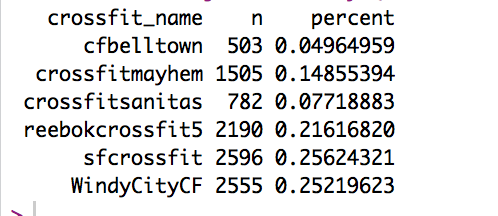
final_dat %>% janitor::tabyl(crossfit_name)
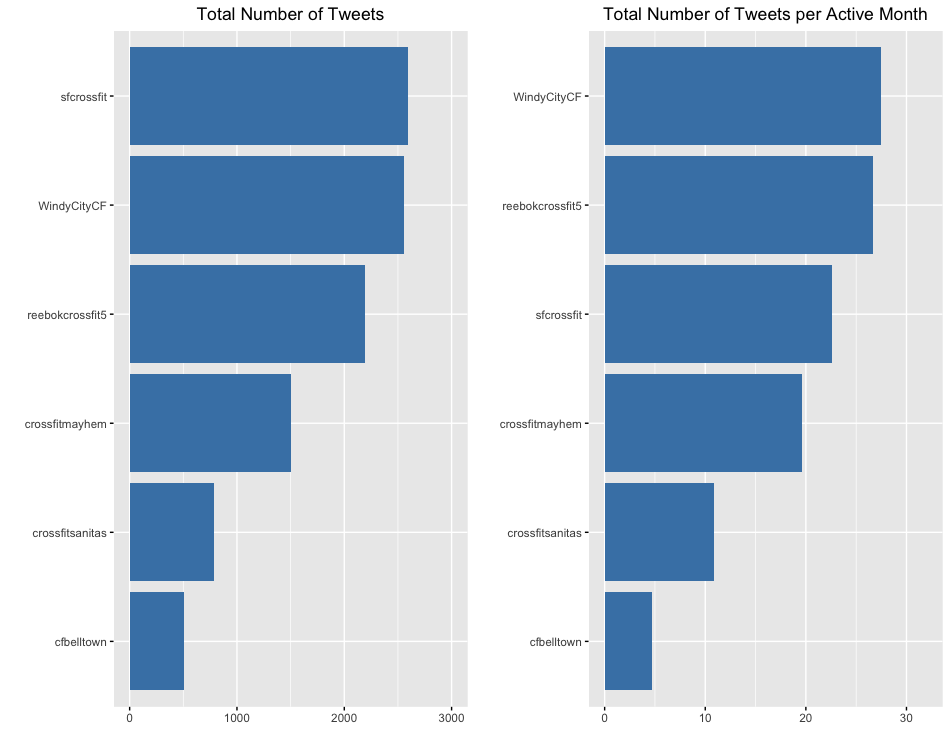
C1. Total Number of Tweets
Sfcrossfit, which is the oldest of these gyms, has the highest number of tweets. However, when looking at the total number of tweets per active month, they were less active than two other gyms.
## total number of tweets

p1 = final_dat[, .N, by=crossfit_name] %>%
ggplot(., aes(x=reorder(crossfit_name, N), y=N)) + geom_bar(stat='identity', fill="steelblue") +
coord_flip() + labs(x="", y="") + ylim(0,3000) + ggtitle("Total Number of Tweets") +
theme(plot.title = element_text(hjust = 0.5),
axis.ticks.x = element_line(colour = "black"),
axis.ticks.y = element_line(colour = "black"))

## number of tweets per active month

p2 = final_dat[, .(.N, start=lubridate::ymd_hms(min(created_at)), months_active=lubridate::interval(lubridate::ymd_hms(min(created_at)), Sys.Date()) %/% months(1)), by=crossfit_name][,
.(tweets_per_month = N/months_active), by=crossfit_name] %>%
ggplot(., aes(x=reorder(crossfit_name, tweets_per_month), y=tweets_per_month)) +
geom_bar(stat='identity', fill="steelblue") + coord_flip() + labs(x="", y="") + ylim(0,32) +
theme(plot.title = element_text(hjust = 0.5),
axis.ticks.x = element_line(colour = "black"),
axis.ticks.y = element_line(colour = "black")) +
ggtitle("Total Number of Tweets per Active Month")

## add both plots to a single pane

grid.arrange(p1, p2, nrow=1)
C2. Total Number of Tweets Over Time
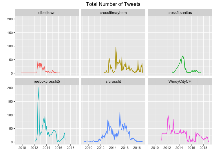
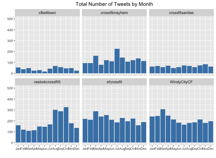
The time series for the total number of tweets by month shows that each gym had one or two peaks from 2012 through 2016 where they were aggressively sharing content with their followers. However, over the past two years, each gym has reduced their twitter usage significantly.
## total number of tweets by month

final_dat[, .N, by = .(crossfit_name, created_at_YearMonth)][order(crossfit_name, created_at_YearMonth)][,
created_at_YearMonth := lubridate::ymd(paste(created_at_YearMonth, "-01"))] %>%
ggplot(., aes(created_at_YearMonth, N, colour=crossfit_name)) + geom_line(group=1, lwd=0.6) +
facet_wrap(~crossfit_name) + labs(x="", y="") + theme(legend.position="none") +
theme(plot.title = element_text(hjust = 0.5),
axis.ticks.x = element_line(colour = "black"),
axis.ticks.y = element_line(colour = "black"),
strip.text.x = element_text(size = 10)) +
ggtitle("Total Number of Tweets")

## total number of tweets by year

ggplot(data = final_dat,
aes(lubridate::month(created_at, label=TRUE, abbr=TRUE),
group=factor(lubridate::year(created_at)), color=factor(lubridate::year(created_at))))+
geom_line(stat="count") + geom_point(stat="count") +
facet_wrap(~crossfit_name) + labs(x="", colour="Year") + xlab("") + ylab("") +
theme(plot.title = element_text(hjust = 0.5),
axis.ticks.x = element_line(colour = "black"),
axis.ticks.y = element_line(colour = "black"),
strip.text.x = element_text(size = 10)) +
ggtitle("Total Number of Tweets by Year")

C3. Tweeting Volume by Year, Month, and Day
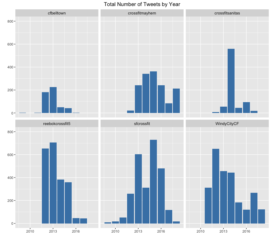
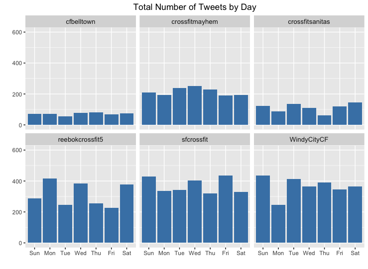
For each Crossfit gym, I plotted the volume of tweets by year, month, and day. Oddly enough, there really are not any noticeable patterns in these charts.
## years with the highest number of tweets

ggplot(final_dat, aes(created_at_Year)) + geom_bar(fill="steelblue") +
facet_wrap(~crossfit_name) + labs(x="", y="") +
theme(plot.title = element_text(hjust = 0.5),
axis.ticks.x = element_line(colour = "black"),
axis.ticks.y = element_line(colour = "black"),
strip.text.x = element_text(size = 10)) + ylim(0,800) +
ggtitle("Total Number of Tweets by Year")

## months with the highest number of tweets

final_dat[, created_at_YearMonth2 := lubridate::ymd(paste(created_at_YearMonth, "-01"))][] %>%
ggplot(., aes(lubridate::month(created_at_YearMonth2, label=TRUE, abbr=TRUE))) + geom_bar(fill="steelblue") +
facet_wrap(~crossfit_name) + labs(x="", y="") +
theme(plot.title = element_text(hjust = 0.5),
axis.ticks.x = element_line(colour = "black"),
axis.ticks.y = element_line(colour = "black"),
strip.text.x = element_text(size = 10)) + ylim(0,500) +
ggtitle("Total Number of Tweets by Month")

## days with the highest number of tweets

final_dat[, created_at_YearMonth2 := lubridate::wday(lubridate::ymd(paste(created_at_YearMonth, "-01")), label=T)][] %>%
ggplot(., aes(created_at_YearMonth2)) + geom_bar(fill="steelblue") +
facet_wrap(~crossfit_name) + labs(x="", y="") +
theme(plot.title = element_text(hjust = 0.5),
axis.ticks.x = element_line(colour = "black"),
axis.ticks.y = element_line(colour = "black"),
strip.text.x = element_text(size = 10)) + ylim(0,600) +
ggtitle("Total Number of Tweets by Day")
C4. Tweeting Volume by Time of Day
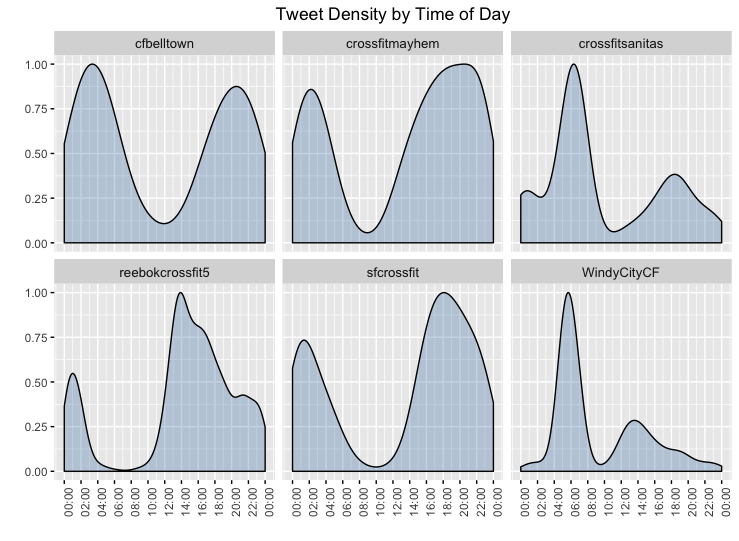
For most of these gyms, we see that the majority of their tweets came during the second half of the day or early in the morning. Given that most Crossfit boxes have their first classes at around 5am or 6am, and are usually most busy in the evening, this indicates that these businesses are tweeting during those hours where their facility is busiest.
## tweet density over the day

ggplot(data = final_dat) +
geom_density(aes(x = created_at_Time, y = ..scaled..),
fill="steelblue", alpha=0.3) +
xlab("Time") + ylab("Density") +
scale_x_datetime(breaks = date_breaks("2 hours"),
labels = date_format("%H:%M")) +
facet_wrap(~crossfit_name) + labs(x="", y="") +
theme(plot.title = element_text(hjust = 0.5),
axis.text.x=element_text(angle=90,hjust=1)) +
theme(plot.title = element_text(hjust = 0.5),
axis.ticks.x = element_line(colour = "black"),
axis.ticks.y = element_line(colour = "black"),
strip.text.x = element_text(size = 10)) +
ggtitle("Tweet Density by Time of Day")
C5. Source of Tweets
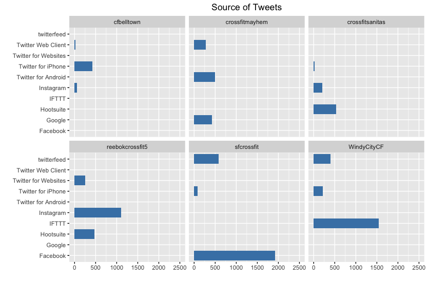
While a couple of the gyms are using a marketing management platform like Hootsuite and IFTTT, the majority of Tweets are coming from a Twitter application or some other social media tool such as Facebook and Instagram.
## source of tweets

final_dat[, .N, by = .(crossfit_name, source)][order(crossfit_name,-N)][,
head(.SD, 3),by=crossfit_name] %>%
ggplot(., aes(x=source, y=N)) +
geom_bar(stat="identity", fill="steelblue") + coord_flip() +
facet_wrap(~crossfit_name) + labs(x="", y="") +
labs(x="", y="", colour="") + ylim(0,2500) +
theme(plot.title = element_text(hjust = 0.5),
axis.ticks.x = element_line(colour = "black"),
axis.ticks.y = element_line(colour = "black")) +
ggtitle("Source of Tweets")
D. Content Characteristics
Let us investigate the characteristics of the content that is being tweeted. From looking at average tweet length to the amount of retweets, this information will further expand our understanding of how these prominent Crossfit boxes are utilizing their Twitter accounts.
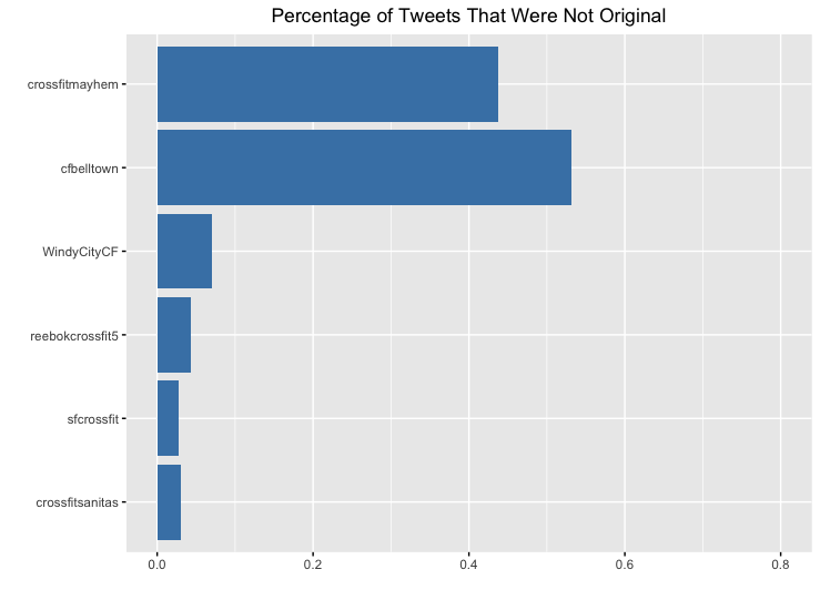
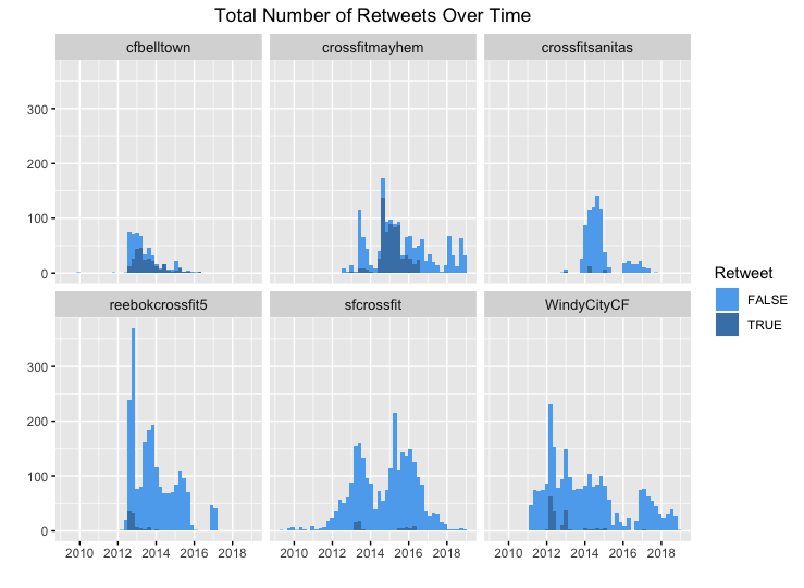
D1. Frequency of Retweets and Original Tweets
Only one gym, cfbelltown, had a majority of their tweets being retweets. Furthermore, a plurality of tweets from crossfitmayhem were not original. In the plots showing retweets over time, we can also see that crossfitmayhem did a lot of retweeting from 2014 through 2016, but started pushing original tweets from then on out.
## retweets and original tweets

final_dat[, .N, by=.(crossfit_name,is_retweet)][, percen := N/sum(N), by=.(crossfit_name)][is_retweet=="TRUE"] %>%
ggplot(., aes(x=reorder(crossfit_name, N), y=percen)) +
geom_bar(stat="identity", position ="dodge", fill="steelblue") + coord_flip() +
labs(x="", y="", colour="") + ylim(0,0.8) +
theme(plot.title = element_text(hjust = 0.5),
axis.ticks.x = element_line(colour = "black"),
axis.ticks.y = element_line(colour = "black")) +
ggtitle("Percentage of Tweets That Were Not Original")

# total number of retweets over time

ggplot(data = final_dat, aes(x = created_at, fill = is_retweet)) +
geom_histogram(bins=48) +
labs(x="", y="", colour="") +
scale_fill_manual(values = c("steelblue2","steelblue"), name = "Retweet") +
facet_wrap(~crossfit_name) + labs(x="", y="") +
theme(plot.title = element_text(hjust = 0.5),
axis.ticks.x = element_line(colour = "black"),
axis.ticks.y = element_line(colour = "black"),
strip.text.x = element_text(size = 10)) +
ggtitle("Total Number of Retweets Over Time")
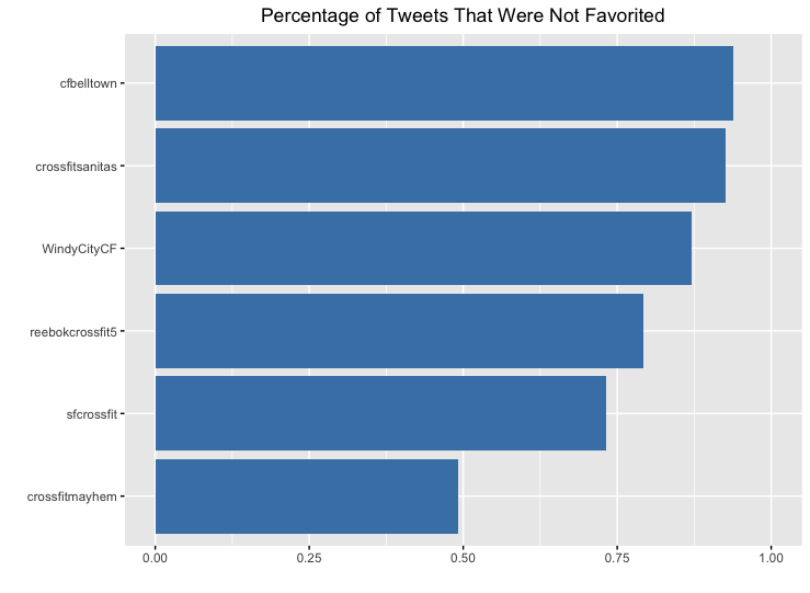
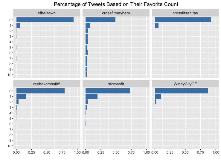
D2. Frequency of Favourited Tweets
Crossfitmayhem was the only box where a majority of their tweets were actually favorited at least once. Furthermore, they had a moderately large number of those tweets that were getting favorited three or more times.
## amount of favorited tweets

final_dat[, .N, by=.(crossfit_name,favorite_count)][, percen := N/sum(N), by=.(crossfit_name)][favorite_count==0,] %>%
ggplot(., aes(x=reorder(crossfit_name,percen), y=percen)) +
geom_bar(stat="identity", fill="steelblue") + coord_flip() +
labs(x="", y="", colour="") + ylim(0,1) +
theme(plot.title = element_text(hjust = 0.5),
axis.ticks.x = element_line(colour = "black"),
axis.ticks.y = element_line(colour = "black")) +
ggtitle("Percentage of Tweets That Were Not Favorited")

## amount of favorited tweets by count

final_dat[, .N, by=.(crossfit_name,favorite_count)][, percen := N/sum(N), by=.(crossfit_name)][favorite_count %
ggplot(., aes(x=reorder(favorite_count, -favorite_count), y=percen)) +
geom_bar(stat="identity", fill="steelblue") + coord_flip() +
labs(x="", y="", colour="") +
facet_wrap(~crossfit_name) + ylim(0,1) +
theme(plot.title = element_text(hjust = 0.5),
axis.ticks.x = element_line(colour = "black"),
axis.ticks.y = element_line(colour = "black"),
strip.text.x = element_text(size = 10)) +
ggtitle("Percentage of Tweets Based on Their Favorite Count")
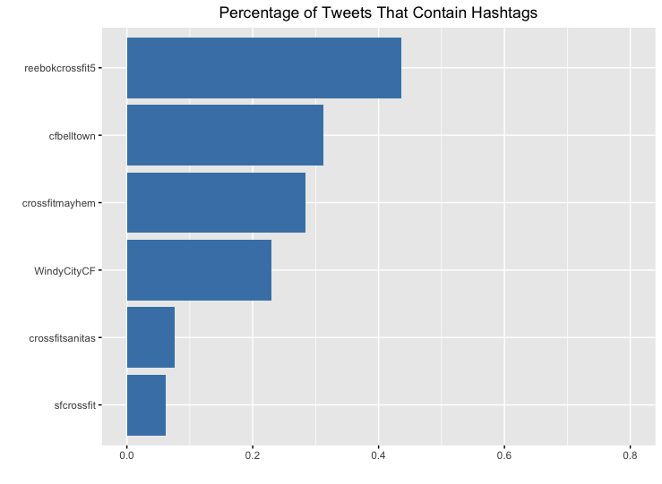
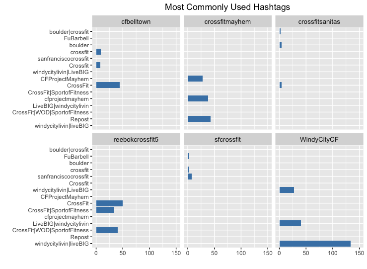
D3. Use of Hashtags
Reebokcrossfit5 had the largest percentage of tweets that contained hashtags while crossfitsanitas and sfcrossfit rarely used hashtags in their tweets. And when it comes to the hashtags that are being used, it seems that these boxes are using the crossfit hashtag and the name of their own gym.
## contains hashtags

final_dat[, .N, by=.(crossfit_name,contains_hashtags)][, percen := N/sum(N), by=.(crossfit_name)][contains_hashtags==1] %>%
ggplot(., aes(x=reorder(crossfit_name,percen), y=percen)) +
geom_bar(stat="identity", fill="steelblue") + coord_flip() +
labs(x="", y="", colour="") + ylim(0,0.8) +
theme(plot.title = element_text(hjust = 0.5),
axis.ticks.x = element_line(colour = "black"),
axis.ticks.y = element_line(colour = "black")) +
ggtitle("Percentage of Tweets That Contain Hashtags")

## frequently used hashtags

final_dat[hashtags != "", ][,.N, by=.(crossfit_name, hashtags)][order(crossfit_name, -N)][,
head(.SD, 3),by=crossfit_name] %>%
ggplot(., aes(x = reorder(hashtags, -N), y=N)) +
geom_bar(stat="identity", fill="steelblue") +
coord_flip() + ylim(0,150) +
facet_wrap(~crossfit_name) + labs(x="", y="", colour="") +
theme(plot.title = element_text(hjust = 0.5),
axis.ticks.x = element_line(colour = "black"),
axis.ticks.y = element_line(colour = "black"),
strip.text.x = element_text(size = 10)) +
ggtitle("Most Commonly Used Hashtags")
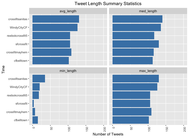
D4. Tweet Length
The following chart shows the summary statistics pertaining to the length of the tweets from each of the crossfit boxes. crossfitsanitas and WindyCityCF seem to have the longest tweets on average, and sfcrossfit has the shortest tweet.
## tweet length

melt(final_dat[, .(avg_length = mean(display_text_width,na.rm=T),
med_length = median(display_text_width,na.rm=T),
min_length = min(display_text_width,na.rm=T),
max_length = mean(display_text_width,na.rm=T)), by=.(crossfit_name)], id="crossfit_name") %>%
ggplot(., aes(x=reorder(crossfit_name, value), y=value)) +
geom_bar(stat="identity", fill="steelblue") + coord_flip() +
labs(x="Date", y="Number of Tweets", colour="Crossfit Box") +
theme(plot.title = element_text(hjust = 0.5)) +
facet_wrap(~variable) + labs(x="Time", y="Number of Tweets", colour="Crossfit Box") +
theme(axis.text.x=element_text(angle=90,hjust=1)) +
theme(plot.title = element_text(hjust = 0.5),
strip.text.x = element_text(size = 10)) + ylim(0,200) +
ggtitle("Tweet Length Summary Statistics")
E. Sentiment Analysis
In order to evaluate the emotion associated with the tweets of each crossfit box, I used the syuzhet package. This package is based on emotion lexicon which maps different words with the various emotions (joy, fear, etc.) and sentiment polarity (positive/negative). We’ll have to calculate the emotion score based on the words present in the tweets and plot the same.
We can see that the majority of tweets for each Crossfit box had a largely positive sentiment, trust and anticipation were other common emotions. For cfbelltown and crossfitsanitas, the third most common emotion was negative.
## sentiment analysis

library(syuzhet)

sentiment_scores = list()

#each_gym="sfcrossfit"
for(each_gym in unique(final_dat[,crossfit_name])){

print(each_gym)

tweet_text = final_dat[crossfit_name==each_gym, text]

# removing retweets
tweet_text <- gsub("(RT|via)((?:\\b\\w*@\\w+)+)","",tweet_text)

# removing mentions
tweet_text <- gsub("@\\w+","",tweet_text)

all_sentiments <- get_nrc_sentiment((tweet_text))
#head(all_sentiments)

final_sentimentscores <- data.table(colSums(all_sentiments))
#head(final_sentimentscores)

names(final_sentimentscores) <- "score"
final_sentimentscores <- cbind("sentiment"=colnames(all_sentiments), final_sentimentscores)
final_sentimentscores$gym = each_gym
#final_sentimentscores

sentiment_scores[[each_gym]] <- final_sentimentscores

}

sentiment_scores <- rbindlist(sentiment_scores)
dim(sentiment_scores)
sentiment_scores

ggplot(sentiment_scores, aes(x=sentiment, y=score))+
geom_bar(aes(fill=sentiment), stat = "identity")+
theme(legend.position="none")+
xlab("Sentiments")+ylab("Scores")+ coord_flip() +
facet_wrap(~gym) + labs(x="", y="", colour="") +
theme(plot.title = element_text(hjust = 0.5),
axis.ticks.x = element_line(colour = "black"),
axis.ticks.y = element_line(colour = "black"),
strip.text.x = element_text(size = 10)) +
ggtitle("Total Sentiment Across All Original Tweets")

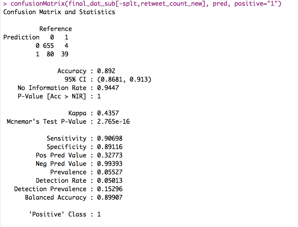
F. Predictive Model
Out of curiosity, I wanted to see if a predictive model could be generated to predict whether a tweet would be retweeted. For this task, I looked at just the tweets from sfcrossfit. The target variable was 0 or 1, with zero representing a tweet that was not retweeted and one representing any tweet that was retweeted one or more times. Using the caret package, I trained a random forest on my training data and tried to predict on new data. We can see from the confusion matrix that the model did a very job at predicting whether a tweet would be retweeted or not. Perhaps with some better feature, a better model could have been produced, but I chose not to invest more time on this task.
library(tidyverse)
library(tidytext)
library(stringr)
library(caret)
library(tm)

final_dat[1:2]

final_dat[, .N, by=crossfit_name]
final_dat_sub = final_dat[crossfit_name=="sfcrossfit",]
final_dat_sub[, favorite_count_new := ifelse(favorite_count==0, 0, 1)]
final_dat_sub[, retweet_count_new := ifelse(retweet_count==0, 0, 1)]
final_dat_sub[1:3]
#final_dat_sub$retweet_count_new

splt <- createDataPartition(final_dat_sub$retweet_count_new, p = 0.70, list = F)
train <- final_dat_sub[splt, .(created_at,favorite_count,is_retweet, display_text_width, contains_hashtags, retweet_count_new)]
dim(train)
test <- final_dat_sub[-splt, .(created_at,favorite_count,is_retweet, display_text_width, contains_hashtags, retweet_count_new)]
dim(test)

congress_rf <- train(x = as.matrix(train[,.(year(created_at), month(created_at),favorite_count,is_retweet, display_text_width, contains_hashtags)]),
y = factor(train$retweet_count_new),
method = "rf",
ntree = 200,
trControl = trainControl(method = "oob"))
congress_rf$finalModel
varImpPlot(congress_rf$finalModel)

pred = predict(congress_rf, as.matrix(final_dat_sub[-splt,.(year(created_at), month(created_at),favorite_count,is_retweet, display_text_width, contains_hashtags)]))
confusionMatrix(final_dat_sub[-splt,retweet_count_new], pred, positive="1")
G. Conclusion
So there you have it. An investigation of how several prominent Crossfit gyms are using their Twitter accounts to engage with consumers. At the end of the day, I would suggest that any business in the health and wellness space should invest more time on Instagram or YouTube than Twitter when it comes to brand marketing or customer acquisition. Twitter is great for news and entertainment, but it isn’t the ideal platform to share fitness content or inspire new members.
